Overview
Understanding the position property in CSS is critical if you need to break out of the default element flow on a page to create page layouts the appear to be multi-layered. This post will walk through this property in depth so that you have a better understanding of how to use it properly.
Basic Page Layout
Let’s start with a basic example containing the following elements:
- A parent container (
.container) - A child section (
.section) - Two boxes (
.box)
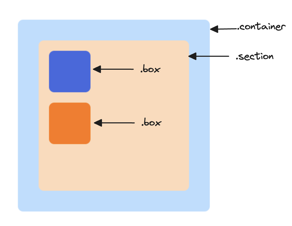
Here’s the HTML. As you can see, nothing too interesting is happening yet. We’ve just set some basic styles on our elements to make it a bit more aesthetically pleasing. All of the starting styles are in base.css, which can be found here. We’ll be working with styles.css to keep the code samples in this post as small as possible.
<html lang="en">
  <head>
    <link rel="stylesheet" href="base.css" />
    <link rel="stylesheet" href="style.css" />
  </head>
  <body>
    <div class="container">
      <div class="section">
        <div class="box blue"></div>
        <div class="box orange"></div>
      </div>
    </div>
  </body>
</html>
No positional styling has been applied to the elements on the page; everything is following the normal flow and should behave exactly as you’d expect.
We have a few ways to change the position of elements on the page without introducing the position property. Maybe we want the blue box to be right-aligned, so we could just set margin-left: auto. Or maybe we want the boxes to be displayed next to each other, so we could set display: flex on the parent. But these techniques are limited, and they don’t give us complete control over where an element is positioned.
The position Property
Suppose we want to change the position of the orange box so that it overlaps the blue box, and we want it to be shifted a bit so that some of the blue box is still displayed. For this, we’ll need to use the position property, which can take on one of the following values:
static(this is the default)relativeabsolutefixedsticky
The absolute one sounds interesting - let’s give it a shot! We’ll make a single change to styles.css by setting the position property on the orange box to absolute.
.orange {
  position: absolute;
}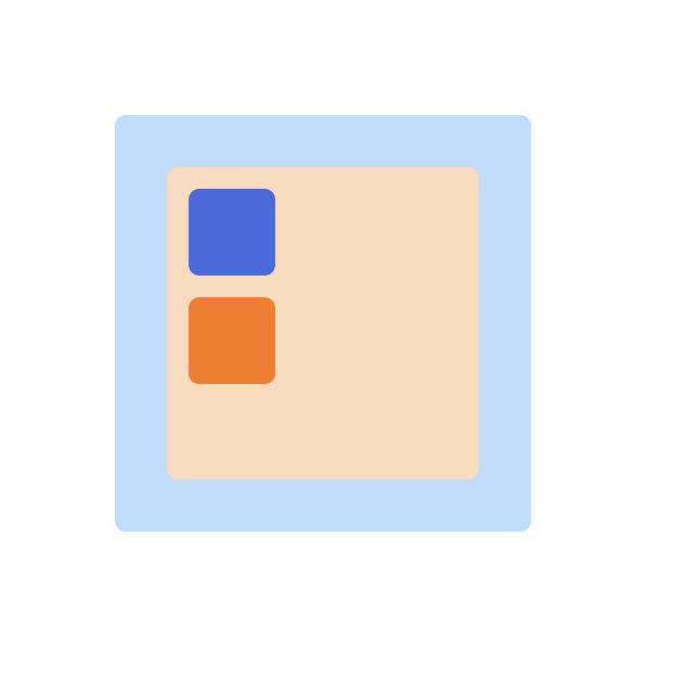
Hmm… that didn’t seem to do anything 🤔 - our orange box is exactly where it was before. This is actually the expected behavior because we forgot one big detail; we never specified where the element should actually be positioned! Just setting position: absolute isn’t enough; we need to provide more clear instructions on where the element should be positioned.
To do that, we can use one or more of the following properties; top, bottom, left, and right. These properties let us specify where the element should be positioned relative to the top/bottom/left/right of something that we’ll discuss later. Without the position property set, though, these properties have no effect.
Let’s see how they work by updating our example and setting top on the orange box to 0.
.orange {
  position: absolute;
  top: 0;
}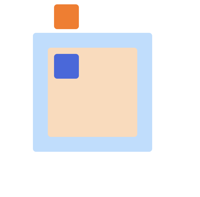
And voilà! The orange box has moved from its original position to the top of the page. Even though we set top to 0, there’s still some space between the top of the page and the top of this box. This is because the box has some top margin set, so it’s actually a few pixels from the top of the page. Additionally, the box still has the same horizontal position, but that’s because we didn’t set the left or right properties. Let’s set the left property to 20px and see what happens.
.orange {
  position: absolute;
  top: 0;
  left: 20px;
}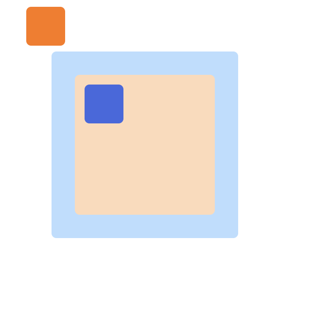
With that change, the box shifted to the left a bit. There’s now 24 pixels of space between the left edge of the screen and the right edge of the box (4 pixels of padding, and 20 pixels from our left property value).
We’ve demonstrated the effect of using the top and left properties, but what about bottom and right? If you were to set those properties in our example you’d see that nothing changes no matter what values you use. This is because top and left take precedence over bottom and right (in most cases).
Note
If the container direction is not left-to-right (the default) and is instead set to right-to-left, then the right property would take precedence over the left property. There are some other edge cases as well, but we won't cover them in this post
Based on what we’ve seen so far, you can infer that the top property specifies the number of pixels from the top border of the page that the element should be positioned. Similarly, the left property specifies the number of pixels from the left border of the page the element should be positioned. The same principle applies for bottom and right.
With that knowledge, we can start to position our element exactly where we want. But first, we’ll need to do some math 🤓.
We want the orange box to be layered on top of the blue box, so we’ll need to figure out the coordinates of the left and top edges of the blue box. If you look at the CSS, you’ll see that the container has a top margin of 56 pixels, and the section inside that container has a top margin of 24px. Add an additional 10 pixels for the blue box’s top margin for a grand total of 90 pixels.
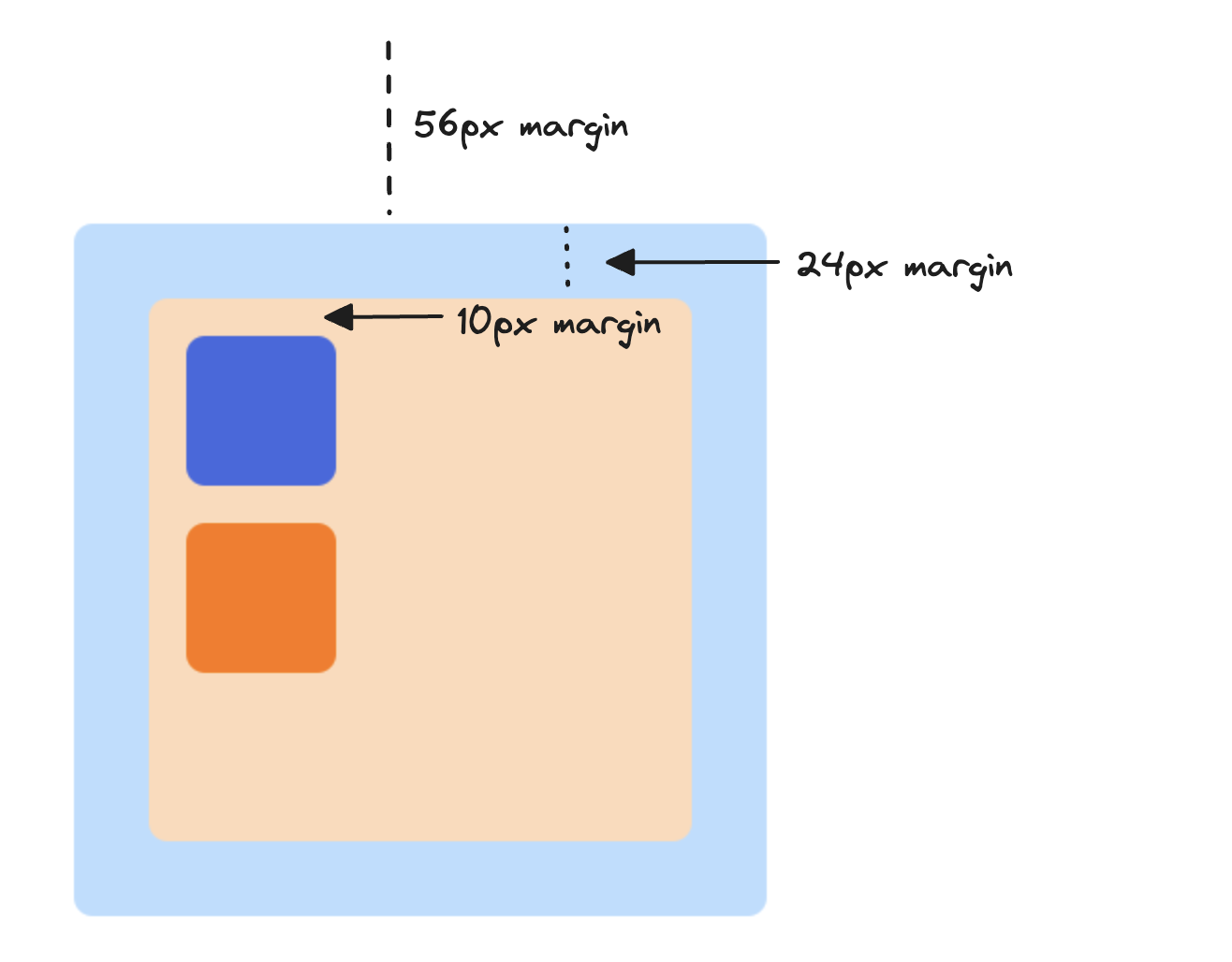
To vertically position the orange box at the same point as the blue box, we would need to set the top property to 86px (the orange box also has a top margin of 4px, so we can subtract that from the total).
That handles the vertical positioning, but we also need to figure out the horizontal positioning. Aside from not wanting to do any more math, there’s another problem. What happens if the margins of the container element change? We’d need to recalculate and update the position. Fortunately there’s a better way to do this that requires less math 🎉.
Relative Positioning
The behavior we’ve observed so far is that when we set an element’s position to absolute, we can use the top, bottom, right, and left properties to specify the position of the element relative to the whole page. We know it’s relative to the whole page because setting top to 0 positioned the element 0 pixels from the top of the page. Wouldn’t it be great if we could position it relative to something else, such as its direct parent? That way, we could avoid doing some math and we wouldn’t need to make updates when other things on the page change.
We can do just that, and it’s as simple as adding a single rule to the box’s parent element; we’re going to set its position property to relative. Let’s also remove the left property from the orange box for now.
.section {
  position: relative;
}

.orange {
  position: absolute;
  top: 0;
}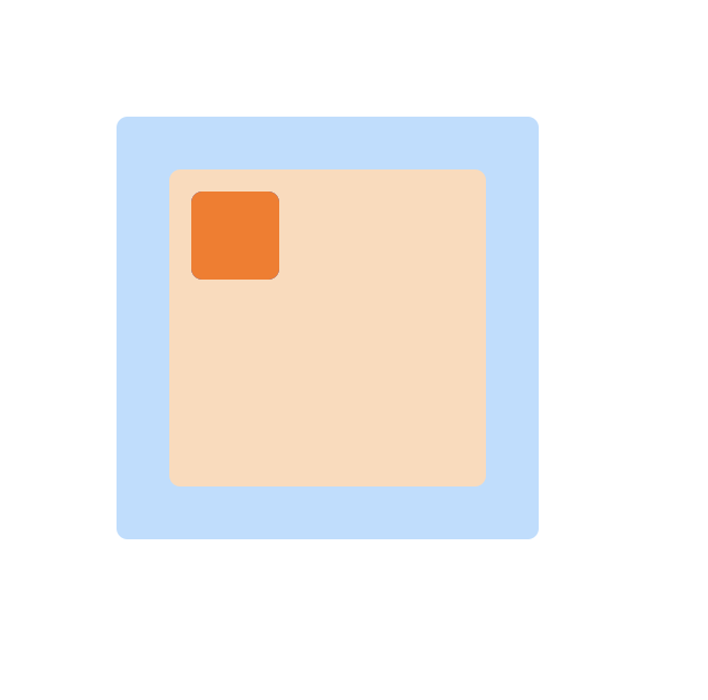
With those changes, our blue box is gone! The orange box is positioned where the blue box used to be. But the blue box isn’t actually gone, it’s just covered up by the orange box. Since we set the parent container’s position to relative, the top property specifies that the position should be relative to the parent container. There’s still some space between the parent and the blue box because of the box’s margin.
Let’s make some small tweaks to get the orange box positioned exactly where we want it. We’ll set both the top and left to 10px.
.section {
  position: relative;
}

.orange {
  position: absolute;
  top: 10px;
  left: 10px;
}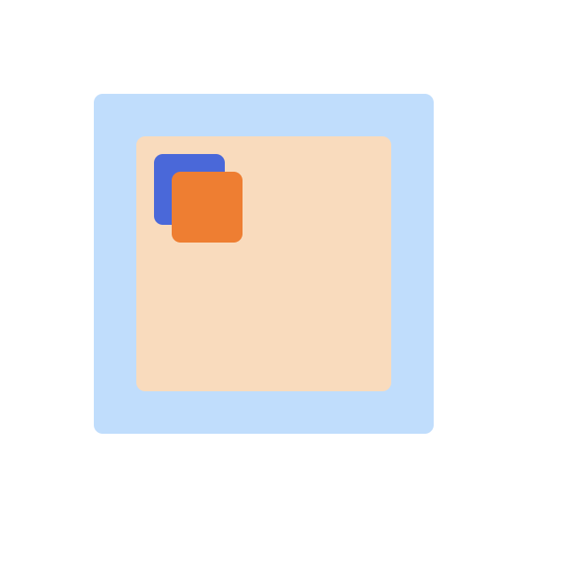
There we go! The orange box is now layered on top of the blue box, and we didn’t have to do any math! No matter what changes outside of that parent element, the orange box will always be in the same position relative to that parent.
This brings us to the core point: an element whose position is set to absolute will be positioned relative to the most immediate parent whose position is set to relative. This most immediate parent has a name; it’s called the offset parent.
To further illustrate this point, let’s remove the position rule from the .section element and instead set it on the .container element.
.container {
  position: relative;
}

.orange {
  position: absolute;
  top: 10px;
  left: 10px;
}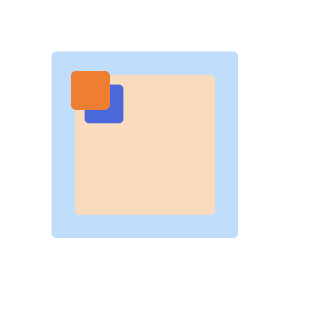
Now, the orange box is positioned relative to the .container div, making that div the offset parent of the absolutely positioned box element.
When no parent element has the position set to relative, then the absolutely positioned element will be positioned relative to the document - this is exactly what we saw initially!
Changing the Stacking Order
At this point, you might be wondering “is there any other reason to set an element’s position to relative?“. There sure is. Let’s take a look.
Right now, the orange box is stacked on top of the blue box. But what if we want it to be stacked under the blue box instead?
Maybe if we update the blue box to be absolutely positioned, then it’ll be placed on the “top layer” since it’s defined before the orange box? Let’s try it out.
.section {
  position: relative;
}

.orange {
  position: absolute;
  top: 10px;
  left: 10px;
}

.blue {
  position: absolute;
}
No luck 😔. If only there were a property we could set on an element to specify the stacking order, something like stacking-priority, which would take an integer value indicating the stacking precedence of the element in relation to other elements. We could use it like this:
.blue {
  stacking-priority: 10;
}

.orange {
  stacking-priority: 0;
}
The element with the highest stacking-priority value would be placed “on top of” elements with a lower value.
Lucky for us, such a property exists! It’s called z-index, and it works exactly how our imaginary stacking-priority works. Let’s try it out by removing the position rule from the .blue class and adding a z-index value.
.section {
  position: relative;
}

.orange {
  position: absolute;
  top: 10px;
  left: 10px;
}

.blue {
  z-index: 10;
}
Uh oh… it’s not working 😢. That’s because there’s one more thing we need to do, which is to set the position property on the blue box to relative.
.section {
  position: relative;
}

.orange {
  position: absolute;
  top: 10px;
  left: 10px;
}

.blue {
  z-index: 10;
  position: relative;
}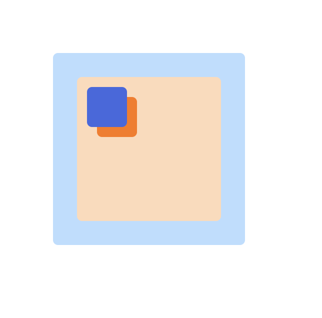
There we go! Now the blue box is stacked under the orange box, exactly what we wanted.
🔑 Point: To adjust the stacking order of an element, two criteria must be satisfied:
- The element’s position must be set to a value other than
static(i.e.relative,absolute). - The
z-indexproperty of the element must be set.
When these criteria are met, a new stacking context is created on the element. Any element nested within that element will belong to the parent’s stacking context (unless, of course, one of those nested elements creates its own stacking context, and that nested element’s children will belong to the new stacking context).
The stacking order of an element is evaluated based on its z-index value compared to the z-index value of other elements within the same stacking context. The element with the highest value will appear “on top” of elements with a lower value.
When a stacking context is created on an element that itself isn’t contained in an existing stacking context, a root stacking context is created on the document.
That’s a lot to digest, so let’s break it down with an example to help solidify our understanding. We’re going to take advantage of the Stacking Context Inspector Chrome extension that let’s us more clearly see stacking contexts and the elements contained within them.
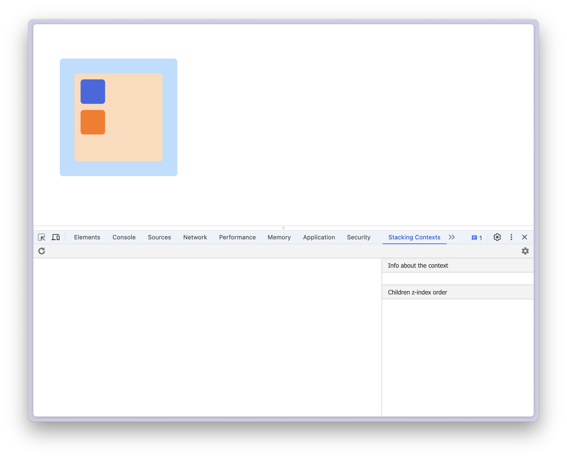
We’ll start by reverting to the original example introduced in the beginning of the post with no position set on any element. As indicated by the stacking context inspector, there are no existing contexts. Our page is effectively two-dimensional along a horizontal x-axis and a vertical y-axis.
Let’s create a stacking context by updating the orange box and giving it a position: absolute and z-index: 5. We’ll also set the top and left properties, as well as the position of the section div to relative.
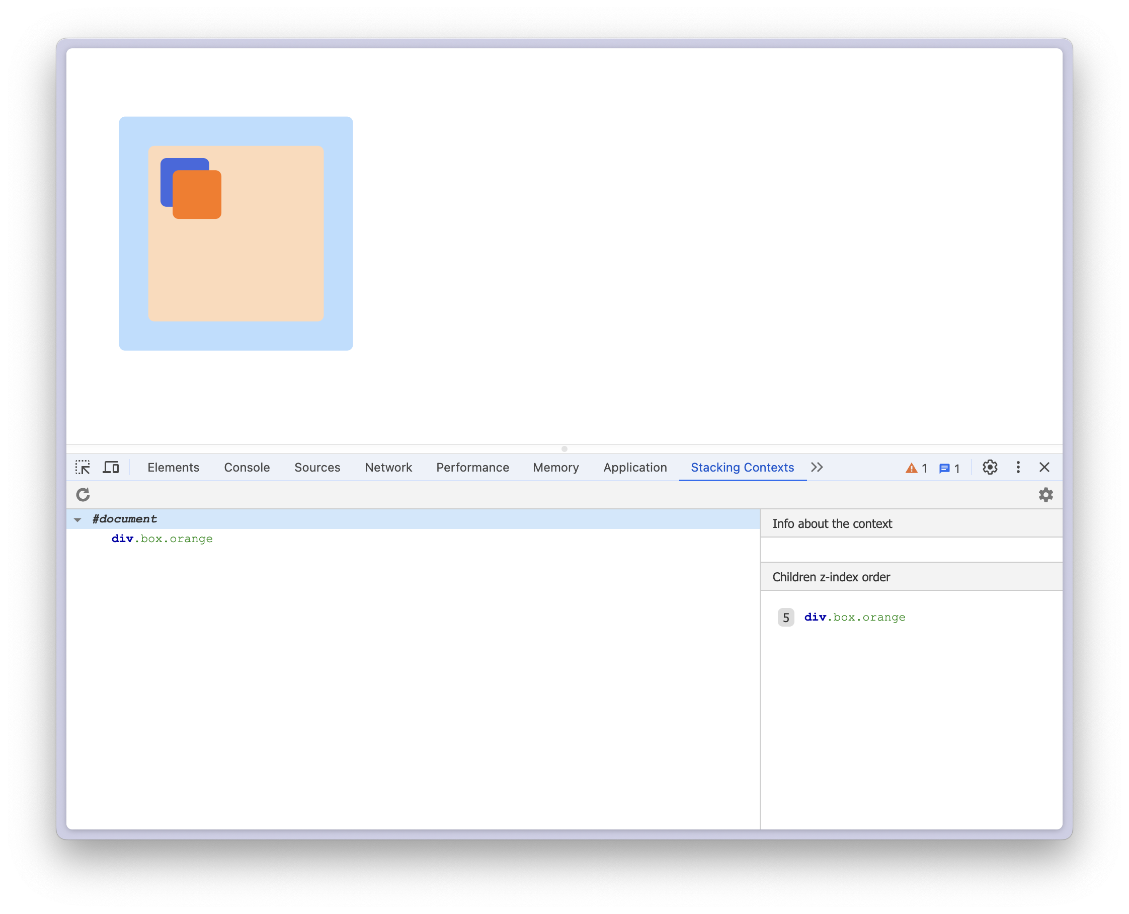
After making that change, we’ve added a third dimension to our page along the z-axis, and you can see that we now have two contexts; one for the document and one for the orange box. Since there were no existing stacking contexts for the box to be a child of, the root document context was created.
Selecting that root context shows that it has a single child, the orange box, which is itself a stacking context with no children of its own. Why isn’t the blue box a child of the document’s stacking context, though? This brings us to an important point: a stacking context can only have other stacking contexts as its children.
Let’s add a stacking context to our blue box by setting position: absolute and z-index: 10.
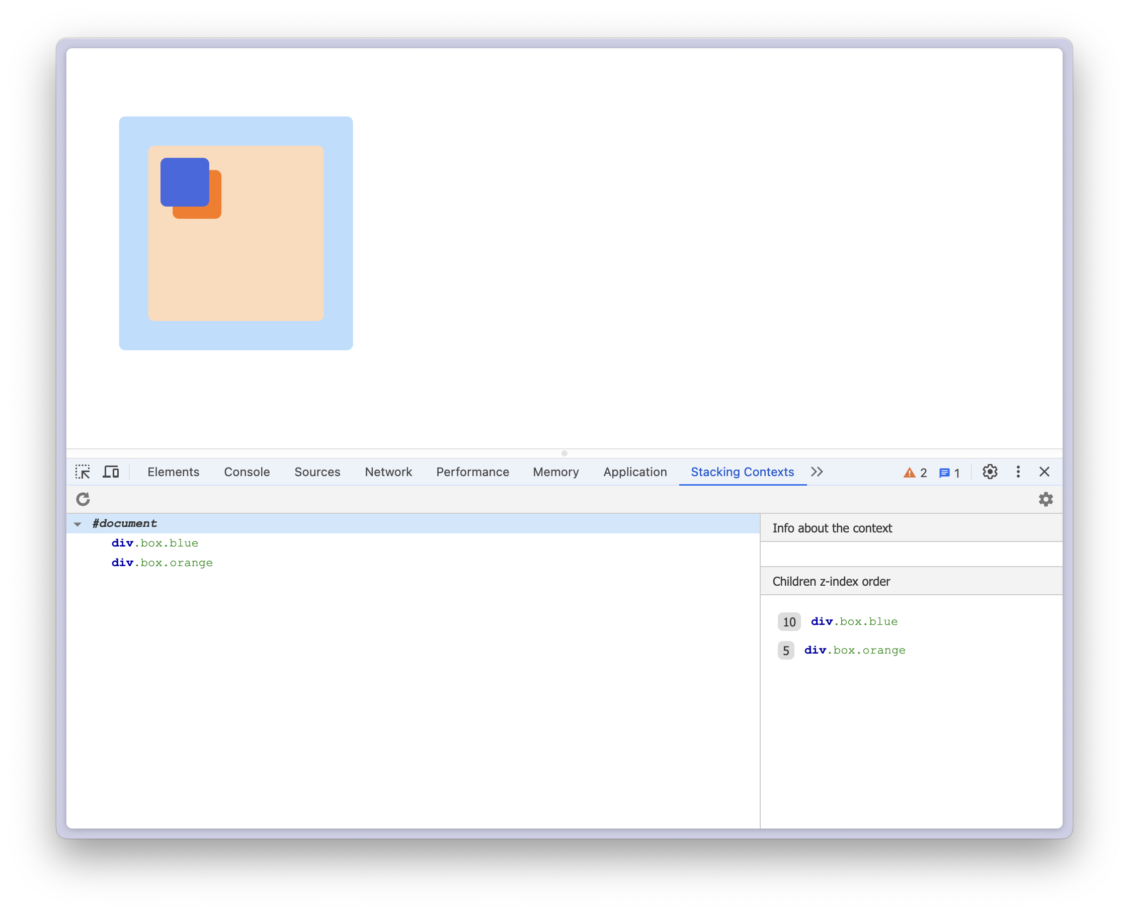
Now the blue box is also a child of the document’s stacking context. And because it has a higher z-index value than the orange box, it is stacked on top!
🔑 Point: A stacking context can only have other stacking contexts as its children.
When we set an element’s position to relative and set its z-index value to any value other than auto, we add a new stacking context (or layer) to the z-axis. With that new stacking context, we can specify how elements should be stacked along the z-axis when they overlap.
Let’s try something else; let’s stack the peach .section div on top of the orange and blue boxes so that the boxes are covered. Seems easy enough - we can just set the z-index on that div to a value higher than the values of the boxes. We’ll set the section’s z-index to 20.
.section {
  position: relative;
  z-index: 20;
}

.orange {
  position: absolute;
  top: 10px;
  left: 10px;
  z-index: 5;
}

.blue {
  position: absolute;
  z-index: 10;
}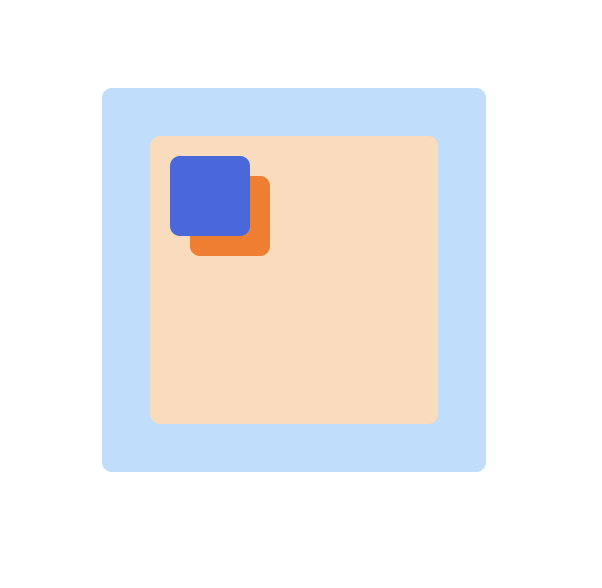
Well that didn’t do anything 😡. Maybe we need to set it to a higher value? But that won’t work either. This is because it doesn’t share the same stacking context as the box elements. Take a look at the stacking context inspector for the current state:
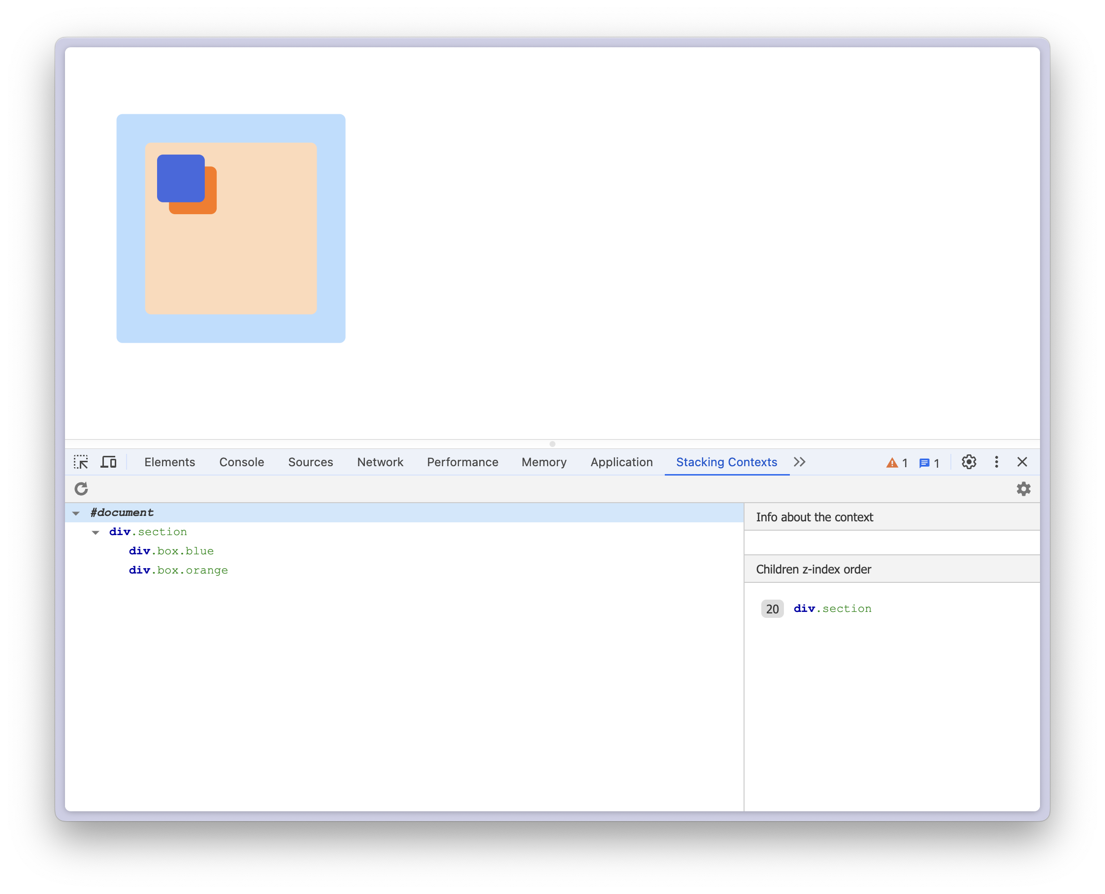
You’ll notice that the section div is not at the same level in the context tree as the boxes.
As previously mentioned, when we set an element’s position to relative and give it a z-index value, a new stacking context is created. Critically, this context only applies to elements whose offset parent is the relatively positioned element. In addition to this element being referred to as the offset parent, it’s also referred to as the stacking context parent.
Let’s break this down. In our example, the .section div has it’s position set to relative. This creates a new stacking context that will be shared by all elements
that are absolutely positioned to the section element, which is currently the two boxes.
When we set the position of the orange box to relative, we created a new stacking context, but that stacking context can only be used by elements absolutely positioned to the orange box (which is nothing). If an element with a stacking context has no nested elements, its stacking context isn’t really doing anything.
The key point to understand is that the z-index only applies in relation to elements within the same stacking context. Because our section div doesn’t share the same stacking context as the box elements, they can’t be stacked relative to one another.
Summary
Hopefully by now you have a more clear understanding of how to use absolute and relative positioning to manipulate the position of elements on the page, as well as how to change the stacking order overlapping elements with z-index. Here are some other great resources that describe these topics: